Voltage cover
Case Study · Concept Work

Voltage

James KordicBeverage brand & 3D packaging2024–258 sections

An exploration of how energy and flavor converge through a reimagined beverage experience. Voltage is a conceptual energy drink brand merging the refreshing taste of lemonade with the bold intensity of an energy drink. Inspired by the electrical potential found in lemons, the brand identity channels a sense of power, clarity, and high-voltage impact across naming, packaging, and visual design. Developed to fill a market gap for flavor-forward options that feel both familiar and exciting, the project redefines what an energy drink can be through design and storytelling.

Client
Rochester Institute of Technology
Date
2024–2025
Role
Graphic Design, Motion Design, 3D Design
01 · The Brief

The Brief

Voltage is a self-initiated beverage brand merging lemonade with energy-drink intensity. The project is part identity exercise, part 3D challenge, and part marketing studio — built to prove the whole product cycle from logo to billboard.

The opportunity: a brand category (energy drinks) where the design language is loud, masculine, and visually exhausting. Voltage carves out a different position — bright, citrus-led, electric — and a different aesthetic — clean type, custom circuit-board pattern, color-coded flavors.

Output spanned identity (logo, type, color), packaging (four flavor labels), 3D production (Blender renders + animated rotations + process documentation), and marketing (posters, OOH mockups, promotional video). One brand, top to bottom.

02 · The Approach

The Approach

Voltage was built as a vertical pipeline — every stage feeds the next. Identity locks the visual rules, packaging applies them to the product, 3D production turns the product into renders, and marketing pushes the renders into the world. Each stage proves the one before it.

Step 01
Brand

Logo, type, color, circuit-board pattern. Lock the identity before anything else.

Step 02
Label

Apply the identity to four flavor labels, color-coded for instant shelf recognition.

Step 03
3D

Build the can in Blender, render each flavor, animate looping product rotations.

Step 04
Market

Compose marketing posters using the 3D renders as the product hero.

Step 05
Pitch

Visualize the brand in real-world urban environments and close with a promo video.

03 · The Work · 08 Projects
0101

Visual Identity

Voltage's visual identity is built to reflect the bold, high-energy personality of the drink itself. The logotype features heavy geometric letterforms with sharp angles and strong contrast, evoking power and clarity. The custom wordmark is paired with an electric bolt icon integrated into the letter "L," a subtle nod to the energy theme and the lemon-powered origin of the brand. Azo Sans and Azo Sans Uber serve as the primary typefaces. A stylized circuit-board pattern reinforces the brand's core message: "Shockingly Refreshing."

// Context

A new beverage brand needs an identity that works as a logo, as a label, AND as a 3D render. Type and color decisions made here would have to survive being printed, photographed, and rendered at production resolution.

// My Role

Designed the wordmark with the bolt integrated into the L, paired Azo Sans with Azo Sans Uber for type, and built the circuit-board pattern that becomes the brand's connective texture across every later artifact.

Field Note ↳

The bolt in the L isn't the joke — it's the wordmark's structural anchor. Once that idea existed, every other Voltage decision pointed back to it.

0202

Can Labels

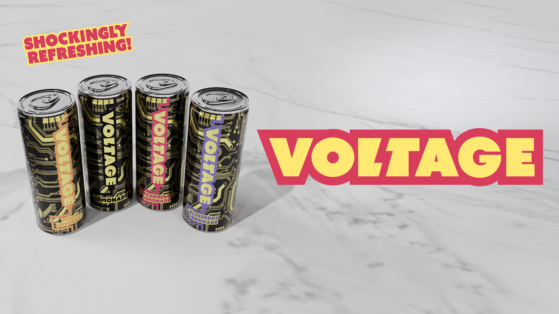
Each Voltage flavor features a fully custom label combining bold typography, vibrant color palettes, and an electrified theme rooted in energy and citrus power. Each flavor (Strawberry, Blueberry, Peach, and Lemon) is color-coded for instant recognition.

// Context

Energy-drink shelf space is brutally competitive — labels have to register from across an aisle. Color coding had to do most of the work; the type had to land at thumbnail size.

// My Role

Designed four flavor labels (Strawberry, Blueberry, Peach, Lemon) using a unified circuit-board base with flavor-specific color palettes. Same template, four entirely different shelf reads.

0303

3D Can Models

A full set of 3D can models built in Blender. Each render showcases a different flavor — Lemonade, Strawberry Lemonade, Blueberry Lemonade, and Peach Lemonade — highlighting the distinct color palette and unified circuit-inspired label design.

// Context

The brand needed photoreal product imagery the marketing could draw from — without ever photographing a real can. 3D was the only path that gave both control and quality.

// My Role

Modeled the can in Blender, applied each flavor label, lit and rendered four production-quality hero shots. Built the materials (metallic finish, label printing texture, condensation) so they hold up to close inspection.

0404

3D Model Process

Inside-Blender screenshots showing visualization and process.

// Context

Process documentation is part of the deliverable on personal work — it proves the technical claim and shows the build under the render.

// My Role

Captured the in-Blender setup at four stages — modeling, UVs, materials, lighting — so the documentation reads as a build log, not a finished gallery.

Field Note ↳

Showing process is a separate design problem. Took the screenshots, then composed them as if they were finished artwork.

0505

3D Animations

Animated 3D can rotations built in Blender — looping showcases highlighting label detail, bold typography, and metallic finish.

// Context

Looping product animations are the social currency of beverage brands — 6 seconds, 360° rotation, label visible at every angle.

// My Role

Animated four looping can rotations, one per flavor. Lit each to hold the label legible across the full spin and rendered as GIFs for native feed performance.

0606

Marketing

Promotional posters built around 3D can renders layered over a custom circuit-board pattern.

// Context

Marketing posters had to use the 3D renders as their hero — proof that the brand pipeline actually works end-to-end.

// My Role

Composed four promotional posters with the renders layered over the circuit-board pattern. Each poster led with a single flavor as the hero product.

0707

Marketing Visualization

Mockups visualizing the Voltage campaign in real-world environments — sidewalks, subway stations, cafés, outdoor walls.

// Context

A poster in isolation is a design exercise. A poster on a bus shelter is a brand. The mockups had to prove the marketing system would survive contact with the city.

// My Role

Composited the posters into four real-world environments — outdoor walls, cafés, transit, sidewalks — choosing each surface to match Voltage's downtown, slightly-electric tone.

0808

Promotional Video

Short-form video introducing the Voltage brand with bold energy — 3D cans, kinetic typography, and a pulsing electronic soundtrack.

// Context

The brand needed a single closing piece — something that pulled the whole project together in 30 seconds.

// My Role

Edited and animated the launch promo: kinetic type, 3D cans on rotation, circuit pattern in motion, electronic soundtrack. The whole brand pipeline on display in one continuous video.

Loading…
0:00 / 0:00
Field Note ↳

A launch video isn't a separate deliverable — it's a compression of everything else you made. Made it last so it could pull from everywhere.

04 · The Recap

A full beverage brand, designed inside-out.

04
Flavor labels
04
3D Blender renders
04
Marketing posters
01
Promo video